When most people think of a brand, they think of a logo. However, a brand is much more than that. While a logo is an important visual representation of your brand, it’s just one piece of the puzzle.
Today though we are concentrating on creating cohesive visual brand identity that works across various platforms, you need more than just one logo.
Many business owners make the mistake of thinking they only need a single logo to represent their brand. But when it comes to real-world applications, such as social media profiles, website headers, or business cards, you’ll quickly realise that one logo isn’t enough.
Whether you’re designing your own logo or hiring a designer, a single design won’t cut it. If you want your brand to stand out and thrive, you’ll need a set of logo variations. We make sure prior to commencing visual branding work we tailor our designs and logo variations to our clients needs. For example some clients need a logo that needs to be applied to tiny clothing labels so we create a version of the primary logo for this specific purpose.
What Are Logo Variations?
Logo variations aren’t completely new designs. Instead, they’re rearranged versions of your primary logo. These variations give your brand the flexibility to remain consistent across different platforms, ensuring it’s recognisable wherever it appears.
Each variation plays a unique role in maintaining your brand identity across different spaces, whether it’s your website, social media, or print materials.
Let’s break down some commonly used logo variations.
Primary Logo
The primary logo is your brand’s main visual identity. This comprehensive design includes everything from taglines to icons and illustrations. It’s usually the most detailed version of your logo and is perfect for places where there’s ample space for it to shine, such as your website header or large print materials.
Secondary Logo
The secondary logo, also known as an alternate logo, is a simplified version of your primary logo. It’s often used when your primary logo won’t fit into a particular space. Depending on the need, the secondary logo can be horizontal or vertical and is typically stripped down to just the brand name or a basic version of the design.
Submark Logo
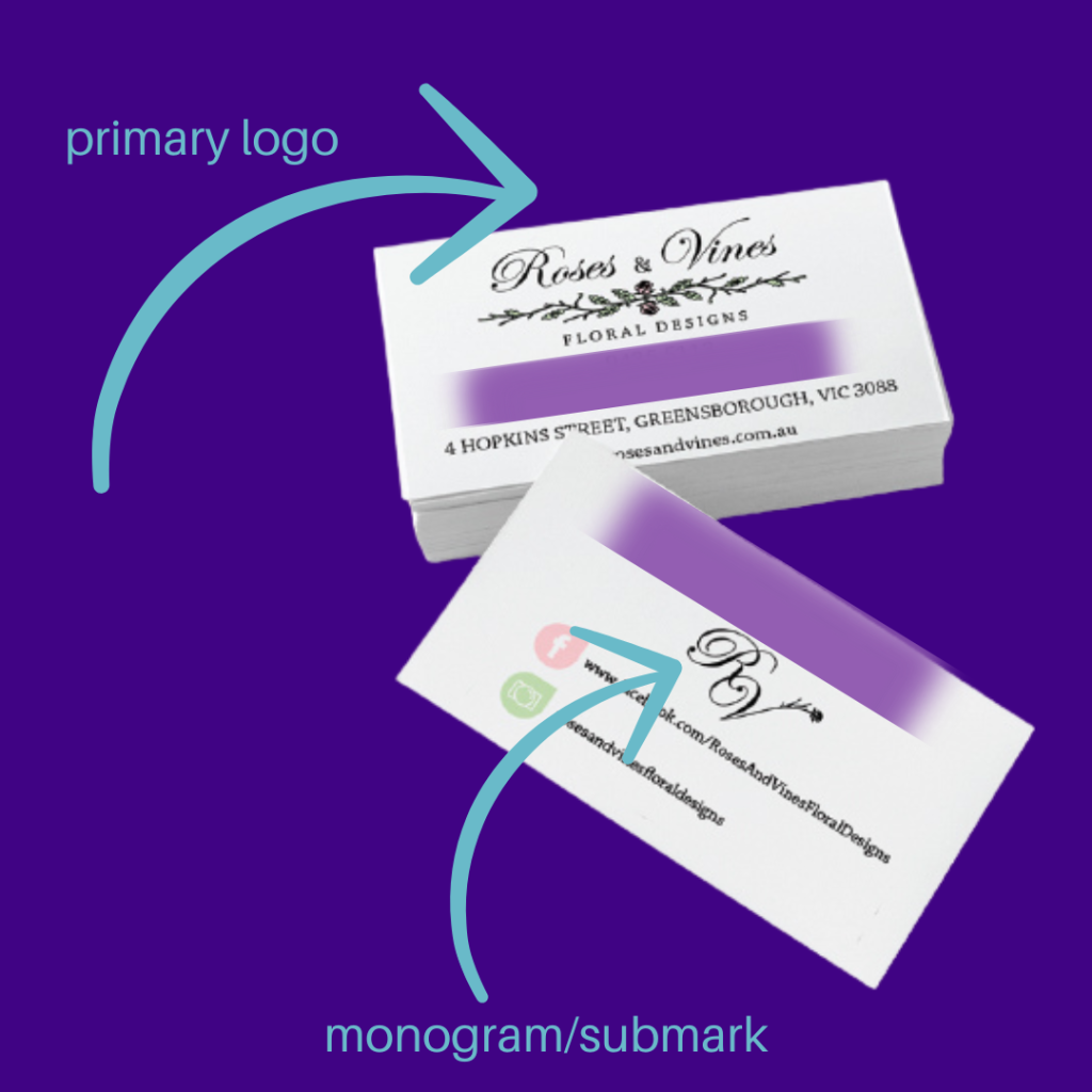
A submark, or brandmark, is even more condensed than the secondary logo. This variation is usually a minimalistic design, often featuring initials or a simple icon. The submark works well in small spaces where other logos would be too overwhelming such as social media profiles for example.
Favicon
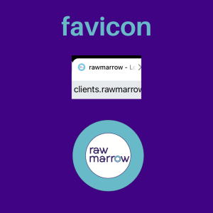
Favicons are those tiny icons you see on browser tabs next to the website’s name. This is the smallest version of your logo and usually includes only the most essential elements, such as initials or a simple graphic. They can also be used for app icons.
Reversed-Out Logo Variation
A reversed-out logo is a version designed to remain distinct when placed on a variety of backgrounds, including busy or coloured ones. This technique works “reversing” the logo out from the background – essentially, the background colour becomes part of the logo design. For example, imagine a logo’s outline placed over a darker background. The negative space within the outline lets the background show through, forming the logo itself.
This version tests the strength and simplicity of your design, as complex logos can lose clarity when reversed out. However, the reward for this simplification is versatility. Reversed-out logos are useful for situations where full-colour designs could clash, such as on photographs, posters, or flyers, and they can create a clean, professional look.
One-Colour Logo Variation
A one-colour logo, as the name suggests, is a version of your logo rendered in just one colour. We talk about why the first iteration of a logo design is done in black and white here. For the one logo variation it can be created in any colour, though brands often choose black, white, or a brand-specific hue. By avoiding multiple colours, one-colour logos sidestep potential contrast issues and are easy to reproduce in both print and digital formats.
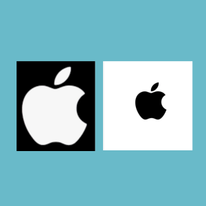
One-colour logos are particularly beneficial because they can be printed in greyscale or monochrome without the need for complex adjustments. This variation is often used for embroidery, stamps, or when printing on promotional materials. Their clarity and simplicity make them instantly recognisable and easy to apply on different surfaces, from business cards to merchandise.
The Importance of Brand Elements.
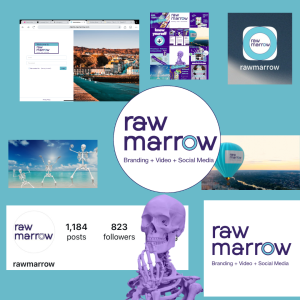
Aside from logo variations, it’s essential to incorporate other brand elements like patterns, textures, or brand photography. These elements help build a cohesive visual identity that supports your logo and strengthens your overall brand presence.
A solid brand identity includes not just logos, but also consistent colour palettes, typography, and design elements that tie everything together. This is why a brand strategy is crucial before jumping into logo design. A well-thought-out brand strategy ensures your visual identity aligns with your business goals and appeals to your target audience.
A holistic brand identity is key to ensuring your business shows up consistently across multiple platforms. By having a set of logo variations and supporting brand elements, you can create a brand that not only looks good but works for your all of your businesses applications and also connects with your audience.
