
While cleaning up my hard drives this morning, I stumbled across a file from last year—a quick-fire logo redesign challenge I gave myself. When I’m deep in strategic or marketing work, I like to take creative breaks. One of my favourite exercises is a ‘3-minute redesign’: I take an original Canva or random logo, set a timer, and try to improve it while keeping the same colour scheme. No overthinking, just rapid iteration.
Taking breaks that contrast with your main work can do wonders for creativity and productivity—especially for small business owners who wear many hats. If you spend most of your time on creative tasks like design, writing, or brainstorming, stepping away to do something more structured or mundane—like organising files or even going for a walk—can give your brain the reset it needs. On the flip side, if your day is filled with strategy, numbers, or admin work, a short burst of creativity can help you see things from a fresh perspective. The key is to break the pattern so your mind has space to recharge and make unexpected connections. That’s exactly why I do quick design challenges like this—it’s a fun mental shift that keeps ideas flowing without overthinking.
I thought it’d be fun to share one of these Canva redesigns with you—along with some key takeaways about what makes a logo work (or not work!).
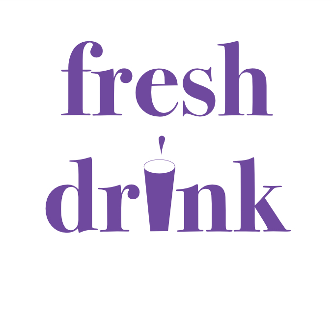
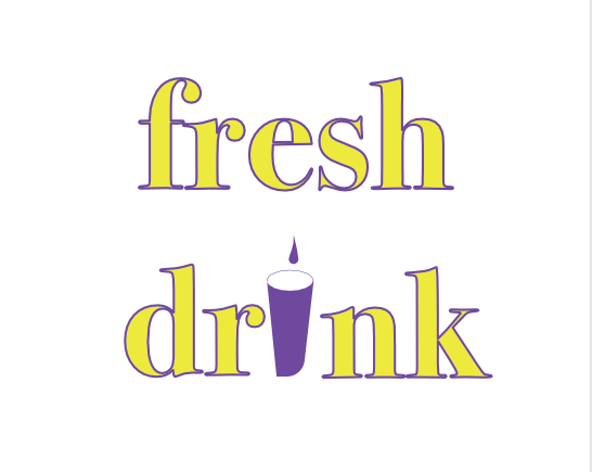
The original logo.
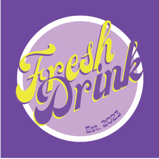
So what are the visual problems with this design?
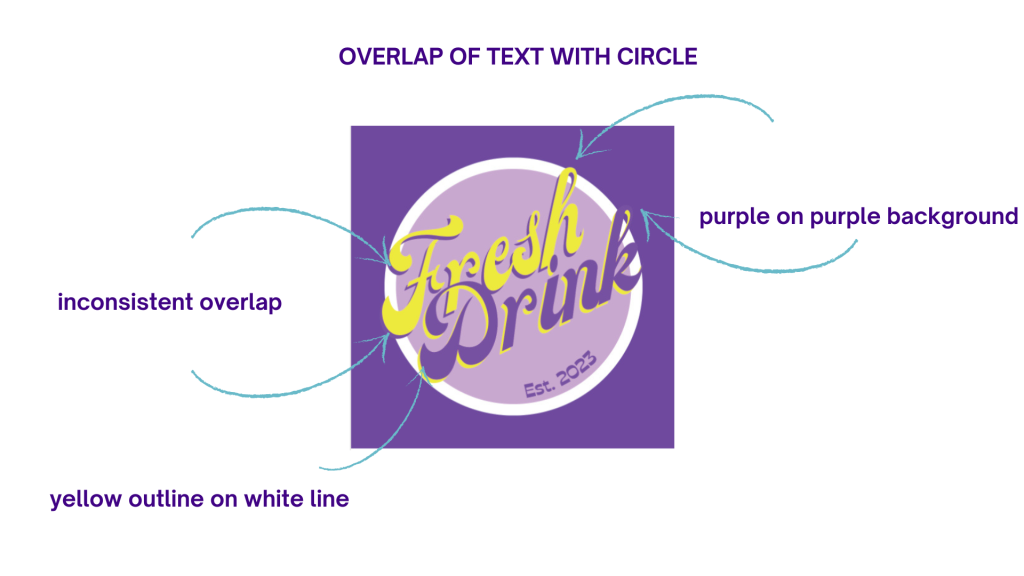
Graphic disharmony– The circle element feels arbitrarily placed within the square canvas. It doesn’t create visual interest or serve a clear purpose.
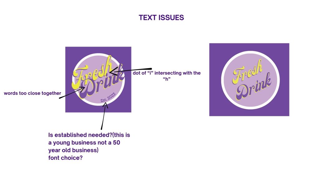
Bad Kerning– Uneven spacing between letters makes the text look off-balance. See more on kerning here.
Bad font choice– The script font isn’t working well for readability. See more on fonts here.
Inconsistent Weight– the “Fresh” has a significantly lighter stroke that “Drink” which makes it look unbalanced.
No hierarchy– the script font is used for both brand name and the “est. 2023” which makes it difficult to discern a primary message or focal point.
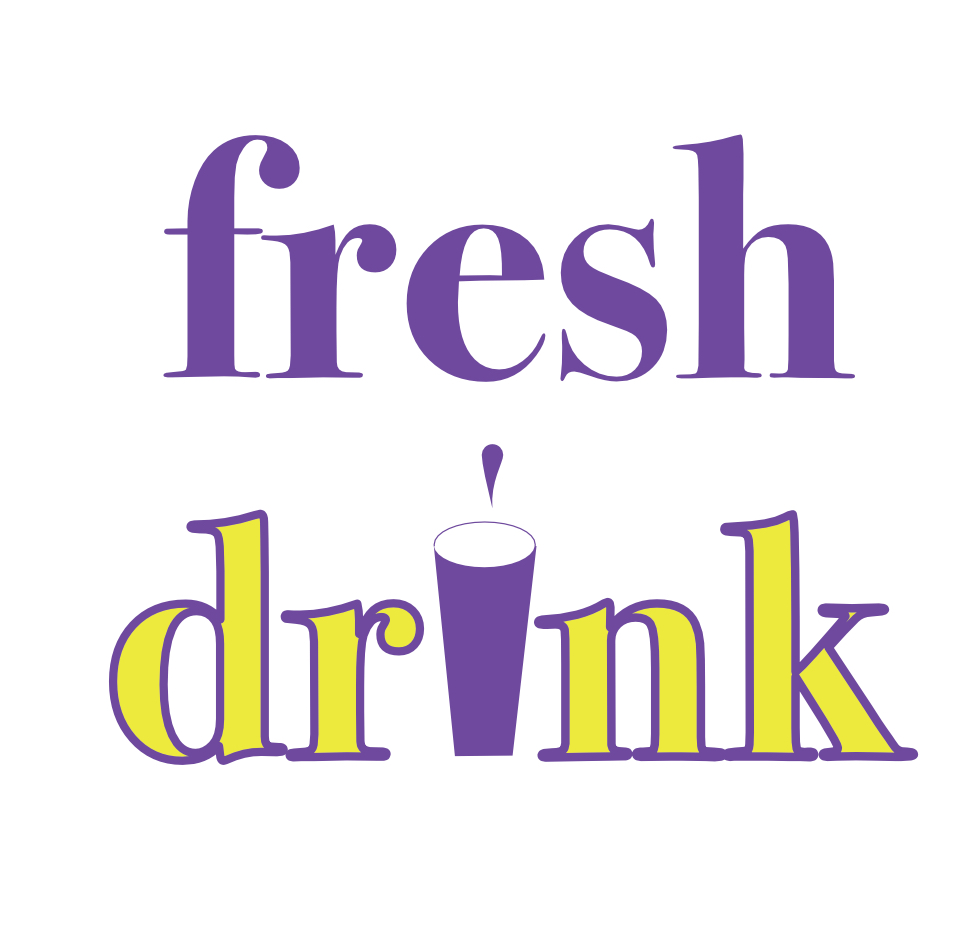
Poor Readability – The overlapping yellow and purple text creates a visual clash, making it difficult to read at first glance. The drop shadow effect is too prominent, reducing clarity.
Unbalanced Typography – The script font has an inconsistent flow, with some letters feeling too tightly packed while others are spaced out. This affects readability and overall cohesiveness.
Weak Contrast – The lavender background is too close in tone to the text shadow, making the overall design less striking. A higher contrast would help the text stand out.
Scalability- This logo would likely struggle to scale down for smaller applications, such as social media. The thin strokes in the script font would become illegible at smaller sizes. It also lacks the simplicity needed for effective use on various backgrounds and materials. Read more about this here.
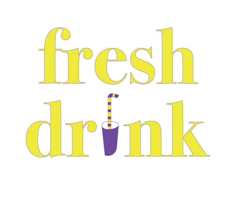
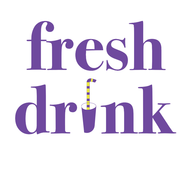
The 3 minute logo redesigns in no particular order.
So, with only three minutes on the clock, I tried to improve readability, contrast, and balance. Here’s what I came up with..
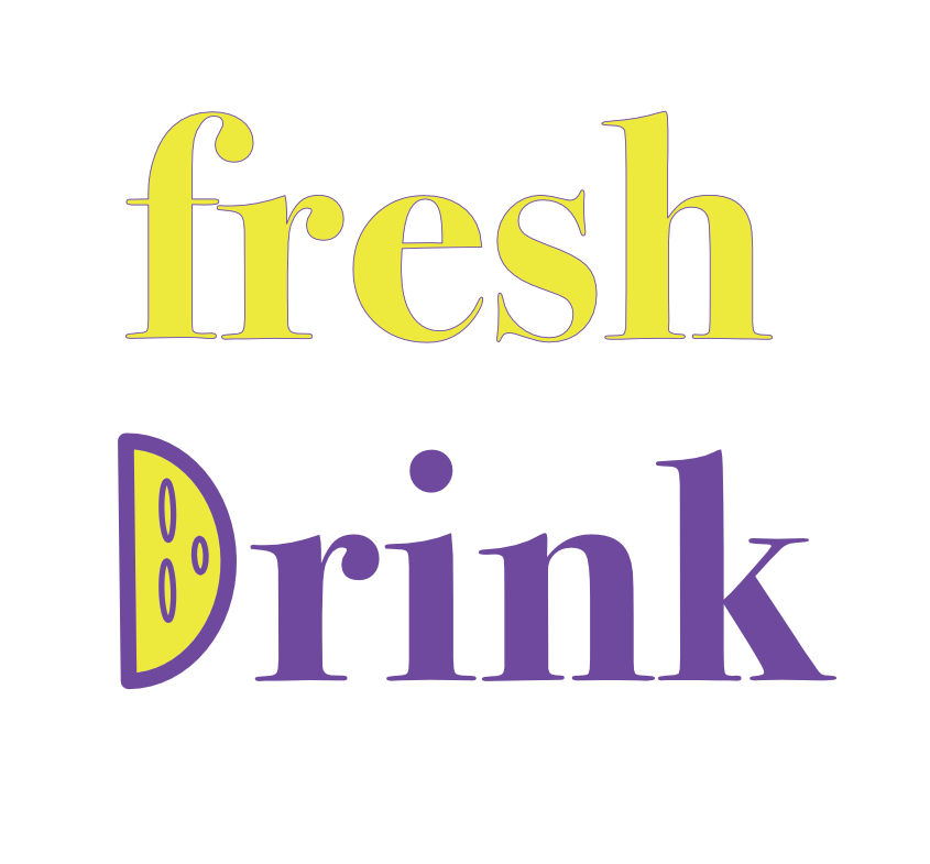
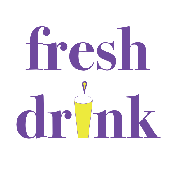
I can not recall what my rationale was for the shape of the drink container used here…hmm maybe to make it more like an “i” I really can’t remember.
Even though these designs aren’t perfect,(there are still kerning and other issues), they’re proof that small tweaks can make a big difference. If you’re designing a logo for your business, playing with different layouts, fonts, and colour contrasts—even in quick bursts like this—can help spark different concepts. It seems here I was playing with the colours more than the concepts 🤣
This is just a fun exercise and there’s no client consultation or brief. When working on a real logo, a deeper process is needed. To learn about the real process used when designing a real logo please read here!
If you have a logo you want me to use in one of my challenges and are happy for me to write about email it here.
If you have designed your own logo and are now feeling unsure about it and want professional feedback then this service was made especially for you.