We have talked about rebranding before. Today I am using Comma Football as an example of analysing a logo rebrand. Full disclosure the reason I know about this brand is because of my soccer mad son who has bought many of their jerseys. I also *love* this brand but the brand designer and analyst in me is attempting to analyse this new logo. (Full disclosure I *loved* their original logo and when my son first showed me the website that was one of the things I said, “Love their logo and branding”.)
I would love to know the brief behind the re design (hahah sticky beak, I know). As I don’t have that information here goes.
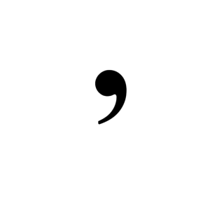
The Original Logo (the comma)
The original logo is bold in its simplicity. A comma – a pure, clean symbol – aligns nicely with the name “Comma Football.” It’s instantly recognisable, holds a sense of narrative pause or continuation (like “the story is still being written”), and is versatile. From a branding standpoint:
- Strong mnemonic device: Easy to remember, identify, and associate with the brand.
- Minimalist aesthetic: On-trend with modern, clean design principles.
- Symbolically rich: A comma suggests there’s more to come. That works really well for a brand promising evolution or progress.
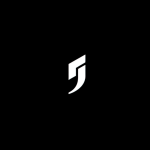
The Rebrand (geometric symbol)
Now, the new logo seems to split the original comma into angular, modular pieces. It looks like a stylised “J” or a hockey stick (but I saw a Nike like swash instantly) or a combination of a number “7” and a swooping curve. There’s a move toward something sharper and arguably more “sport tech” than lifestyle or streetwear.
They’ve said it’s because they’re not just making jerseys anymore — they want to build “the world’s biggest football brand.” So, what are they trying to do here?
The Good
- Aesthetic evolution: It’s more futuristic, maybe appealing to a broader or younger market that’s into performance, technology, or innovation.
- Bolder statement: The angular cuts suggest action, speed, strength — typical qualities associated with sport branding (think Nike swoosh, Puma, Adidas).
- Brand expansion: This new form may be their attempt to visually separate themselves from being just a jersey label.
The Weakness
- Loss of narrative and identity The original had a strong story. The comma felt intentional, tied to the name and unique. This new mark, while slick, feels less rooted in the brand’s DNA.
- Disconnection The separation of elements in the new logo creates a sense of fragmentation. If the brand’s ethos is unity, evolution, or flow, this works against it.
- Generic feel The updated mark starts to look like a tech or esports logo, rather than something culturally tied to football. That risks alienating an existing audience.
My questions are
Does this new logo say what the brand stands for?
- Will people instantly associate this with Comma Football — or mistake it for something else?
- Is it memorable, or just fashionable?
It loses in the sense of the emotional connection and recognisability of the original identity — especially if your name is literally “Comma” and the logo no longer resembles a comma. (I mean it’s there but not as clean).
When it comes to using a logo across different settings — especially in small-scale applications like a favicon or social media profile image — the original Comma Football logo stands out as the stronger choice. Its simple, bold shape is instantly recognisable even at tiny sizes, making it highly versatile and memorable. The new rebranded logo, while more intricate and visually dynamic, loses clarity at small scales. The separation of elements and sharp angles may look slick in large formats, but they don’t hold up as well when scaled down — making it harder for audiences to identify or connect with the brand at a glance. A good logo should be flexible, and in this case, the original comma wins out.
My view is that while the new logo might work from a style perspective, it loses the semantic and emotional value of the original. In the race to become “big,” brands often trade uniqueness for perceived polish — but polish without story is just surface.
If they want to show evolution, they could have layered meaning into the redesign. As it stands, for me at least the connection feels lost. Maybe they will provide more context about their direction as a brand soon. Yes, I still love their jerseys 🙂
If you are considering a strategic rebrand or a logo rebrand and want some help we have you covered.
Pingback: Analysing a logo rebrand- Ribena - rawmarrowblog
Pingback: Analysing a logo rebrand- Ribena - rawmarrowblog
Comments are closed.