CMYK vs. RGB Future-Proof Your Branding
As a small business owner, you know that every detail counts. From your logo to your business cards, your brand’s visual identity is crucial to making a lasting impression. However did you know that the colour mode used in your designs can lead to unexpected results, especially when it comes to printing.
Many small business owners use Canva or similar to design branding elements. See this post about why you shouldn’t design your logo in Canva.
You won’t be the first person to create a brand with RGB-first colours, only to find that it doesn’t translate well when printed.
Many small businesses overlook the importance of planning for both digital and print needs. This can result in major inconsistencies, especially when the brand needs printed touchpoints like signage, merchandise, stationery, and more. In short, a brand should never be designed solely with digital use in mind, even if the initial focus is online.
The RGB vs. CMYK Dilemma
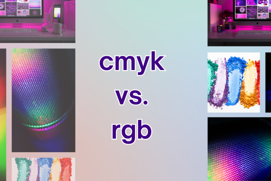
RGB (Red, Green, Blue) is the colour model used for digital displays, such as computer screens and televisions. In this model, colours are created combining different intensities of red, green, and blue light. On the other hand, CMYK (Cyan, Magenta, Yellow, Key/Black) is the standard colour model used in printing. This model involves mixing different proportions of cyan, magenta, yellow, and black inks to produce a wide range of colours.

However, there is a significant challenge when it comes to translating vibrant RGB colours into the CMYK format for print. The problem lies in the fundamental differences between the two models. While RGB uses additive colour mixing (where combining all three primary colours creates white), CMYK uses subtractive colour mixing (where combining all four primary colours creates black). This variance often leads to discrepancies in colour reproduction.

When designing materials for your brand that will involve printing – whether it’s signage, uniforms, promotional merchandise, or any other physical format – it is crucial to consider the limitations of converting RGB colours to CMYK. If you design solely in RGB and then convert it to CMYK without making necessary adjustments, there is a high chance that the printed output will suffer from faded hues, dull tones, or even complete colour mismatches.
To ensure accurate colour representation across both digital and print media channels, it is recommended to start your design process with the end result in mind. Begin working in CMYK from the beginning if your primary focus will be on print materials. By doing so, you can have greater control over the colour palette and avoid potential disappointments or surprises when it’s time to bring your designs into the physical world.
Additionally, collaborating closely with your printer throughout the design process can help mitigate any unexpected colour shifts or inaccuracies. (If you work with us for branding and printing we do all this for you automatically). Otherwise if you are organising through your own printer they can provide valuable insights and suggestions on how to optimise your designs for not only the CMYK format, but to the materials you are printing on. For example printing on poster gloss paper is very different to printing on material of a hat or bag.
A colour management system can help you accurately predict how colours will appear in print- small or solo business owners may not know how to set this up. If you are interested in learning more about colour management read more here.
Why CMYK Should Come First
Here’s the simple truth: CMYK-first designs convert to RGB with far greater consistency than the reverse. By starting with CMYK, you avoid surprises down the line when your designs inevitably end up on a banner, business card, or other printed medium.
When you design with CMYK at the start you ensure you are prepared for the full spectrum of brand visibility. Even if you think you won’t need for printed materials, consider items such as:
- Building signage
- Employee uniforms
- Vehicle wraps
- Event booths, market banners etc.
- Promotional merchandise
- Standard printed materials (brochures, business cards, etc.)
RGB

CMYK

Planning for these touchpoints ensures the brand stays cohesive and professional as it evolves.
By understanding the difference between RGB and CMYK, you can ensure that your brand looks its best, both online and in print. Plus you can avoid
- Colour Mismatches: When you design in RGB and convert it to CMYK for printing, the colours can appear duller or completely different.
- Wasted Money: Colour mismatches can lead to costly reprints and damaged brand reputation.
- Missed Opportunities: A strong, consistent brand image can attract customers and increase sales.
If you need help just reach out.

Pingback: Why Your Photos Look Oversaturated After Posting on Instagram. - rawmarrowblog
Comments are closed.