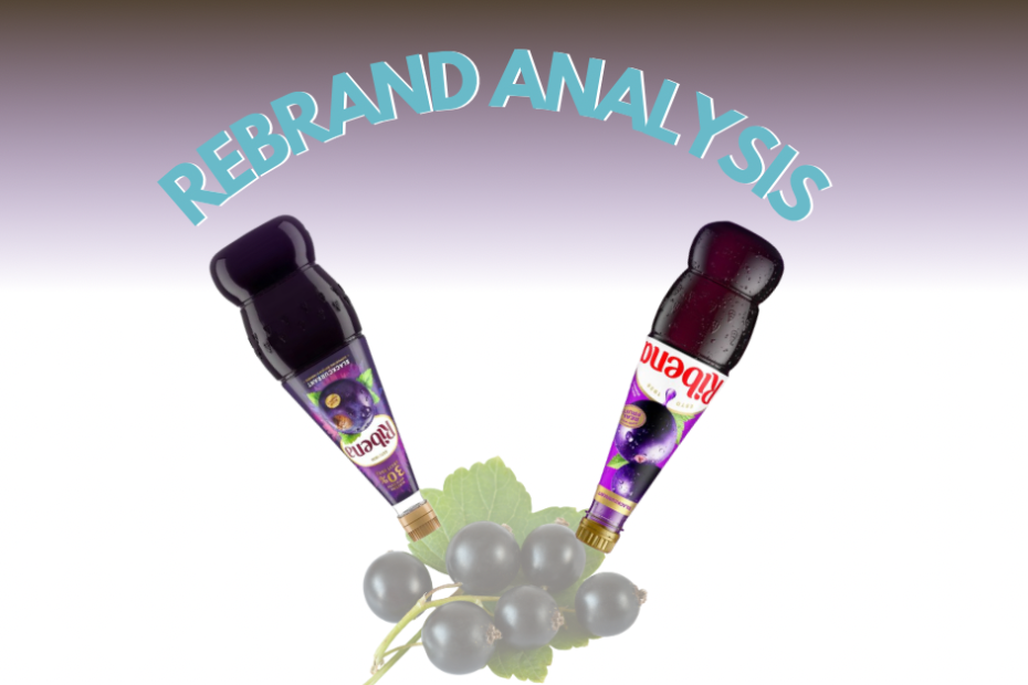
Analysing a logo rebrand- Ribena
I came across a before-and-after image of Ribena’s rebrand on LinkedIn, and it got me thinking. (You can read about Ribena’s history here. ) As someone who… Read More »Analysing a logo rebrand- Ribena
I came across a before-and-after image of Ribena’s rebrand on LinkedIn, and it got me thinking. (You can read about Ribena’s history here. ) As someone who… Read More »Analysing a logo rebrand- Ribena

There’s a trend floating around in the design world right now called “Brand in a Day.” You’ve probably seen it. It’s pitched as a quick, affordable way… Read More »Why We Don’t Offer “Brand in a Day” (And What to Consider Before You Book One)
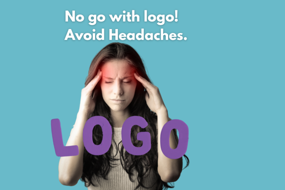
Three logos. Three designers. Zero satisfaction.That’s the story I saw in a Facebook comment last week, and I couldn’t believe it. Not because design mishaps… Read More »No go with logo! Avoid Headaches.

Do your photos appear overly saturated, too contrasty, or just “off” compared to how they looked before uploading to Instagram? Learn why and some work arounds!

While cleaning up my hard drives this morning, I stumbled across a file from last year—a quick-fire logo redesign challenge I gave myself. When I’m… Read More »The 3-Minute Logo Redesign Challenge.

Make your brand stand out with tailored logo variations. We design logos that fit your unique needs, ensuring versatility across all platforms and applications.

In today’s digital age, platforms like Canva have made design more accessible than ever. Grab our free Canva guide here. While Canva is a fantastic… Read More »Why You Shouldn’t Use Canva Templates for Your Logo.

Imagine you’re meeting a potential client for the first time. You’d want to make a strong impression, right? Well, your print marketing materials are like… Read More »Printing: Elevate Your Brand with Every Touch

Kerning is a vital aspect of typography that often goes unnoticed but plays a significant role in enhancing the visual appeal of written content. Clients are usually unaware of kerning issues in their branding or brochures until we draw it to their attention. At Rawmarrow we are acutely aware of how small details like kerning can make a big difference in branding and content creation.