Dark blue is popular in branding and marketing. The point of these blog posts is to examine colours and their associations and applications for branding or marketing materials. Our first in this series was the colour yellow. We often find that many small business owners will choose their favourite colour for their branding colours- we have spoken about this before and it’s usually NOT the way to go.
Dark Blue.
Today we examine dark blue, a colour that embodies depth, trust, and sophistication, it holds a significant place in both psychology and marketing. Often associated with calmness and stability, dark blue is a favourite among brands aiming to project reliability and authority. We will examine lighter shades of blue down the track.
Cultural Significance.
Dark blue holds varying meanings across different cultures, reflecting its rich history and broad significance.
Western Cultures: In many Western societies, dark blue is associated with authority and power. It’s a colour of uniforms (police, navy etc) and business suits, symbolising trustworthiness and respect. Historically, dark blue has also been linked to royalty and the aristocracy, adding an element of prestige.
Eastern Cultures: In China, dark blue can represent immortality, associated with the Taoist belief in the indigo hue of the heavens. In contrast, it can also symbolise the unknown and mystery, reflecting the deep, unfathomable aspects of life. Dark blue is a Korean colour of mourning.
Middle Eastern Cultures: Dark blue is often viewed as a protective colour, warding off evil and bringing peace. It’s a common colour in traditional attire and architecture, symbolising both spiritual and physical protection.
Historical Context: Historically, dark blue was a rare and expensive dye, often reserved for the wealthy or powerful. The colour was difficult to produce, making it a symbol of status and affluence. This historical association with luxury continues to influence how dark blue is perceived today, especially in fashion and design.
Psychological Impact of Dark Blue.
Dark blue evokes a range of emotional responses, primarily centred around feelings of trust, calm, and intelligence. Unlike lighter shades of blue, which can feel airy and whimsical, dark blue is grounded and serious. It’s a colour often associated with depth—think of the vastness of the ocean or the night sky. This makes dark blue particularly effective in creating an atmosphere of stability and reliability.
Common perceptions of dark blue include:
Trust and Authority-dark blue is frequently used in corporate branding to convey professionalism and reliability. It’s no coincidence that many financial institutions and legal firms favour this colour, as it instills confidence and suggests competence.
Power and Success-Dark blue hues evoke feelings of strength and determination. This association can be leveraged brands that want to project an image of leadership and excellence.
Calm and Serenity-The colour’s strong ties to nature—the deep sea, the twilight sky—make it a symbol of peace and tranquillity. Dark blue can lower heart rates and reduce stress, making it an ideal choice for environments where a calming presence is desired.
Intelligence and Logic-Dark blue is also linked to intelligence and a logical approach. It’s often seen as a colour of wisdom and is favoured in academic settings and brands that want to project knowledge and insight.
However, dark blue can also come across as distant or overly conservative if used excessively, so balance is key.
DARK BLUE MOOD BOARD
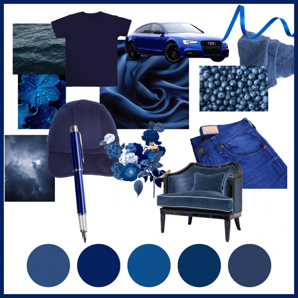
This mood board displays the versatility and impact of dark blue in design and branding, we’ve curated a mood board showcasing various shades of dark blue and their unique emotional tones.
These visuals will provide a deeper understanding of how different dark blue give off different emotional feelings.
Marketing Applications
Brands have long harnessed the power of dark blue to convey specific values and connect with their audience on a deeper level. Here are a few examples of successful campaigns that use dark blue effectively.
IBM: IBM uses to project reliability and technological prowess. The colour reinforces the brand’s reputation as a leader in innovation while also conveying trustworthiness, crucial in the tech industry.
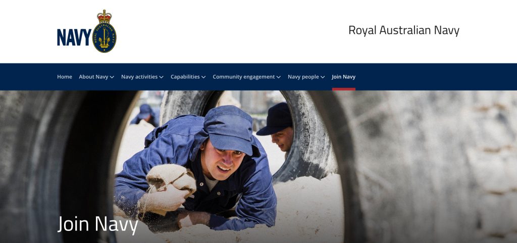
Navy: The use of dark blue in naval uniforms and recruitment materials is a prime example of how colour can embody tradition, honour, and discipline. The shade is synonymous with strength and service, helping to attract those who resonate with these values.
Ford: The car manufacturer Ford incorporates dark blue in its logo, which reflects durability, trust. The colour’s association with stability is crucial in the automotive industry, where consumer trust is paramount.

Samsung: The South Korean electronics giant uses dark blue in its branding to communicate innovation, quality, and technological sophistication. This choice of colour helps Samsung maintain its position as a leading global brand, especially in a highly competitive market.

Nivea Started with a dark blue but over time made it a little lighter and brighter to make it more appealing to buyers.

These brands illustrate how dark blue can be a powerful tool in branding, conveying messages of stability, trust, and intelligence.
Practical Tips.
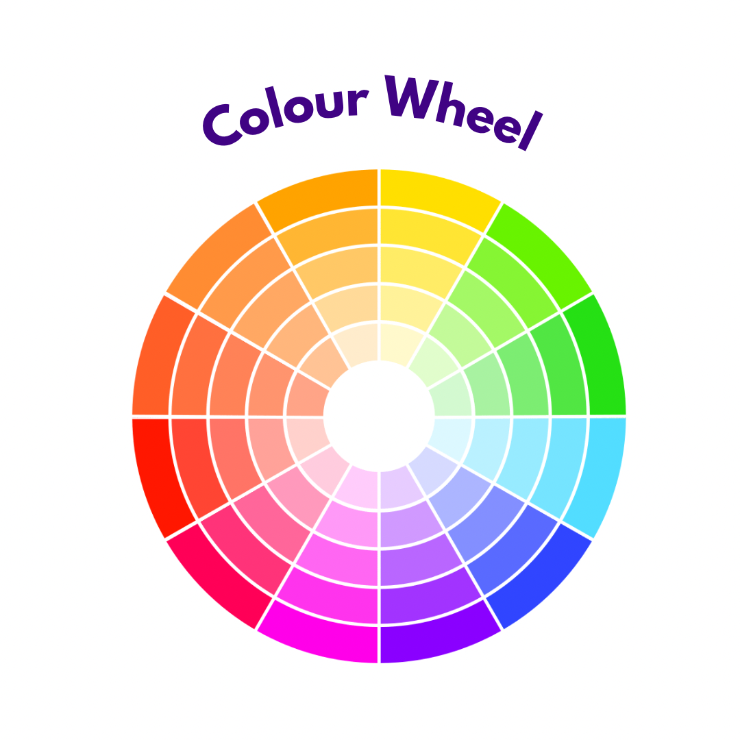
The Colour Wheel.
Basic Terms
- Shades: Created adding black to a colour, making it darker. eg. Darker versions of dark blue, like
- Tints: Created adding white to a colour, making it lighter. eg. Lighter versions of dark blue like mid blue.
- Tones: Created adding grey to a colour, creating a muted or desaturated version.eg. Muted versions of dark blue like blue gray.
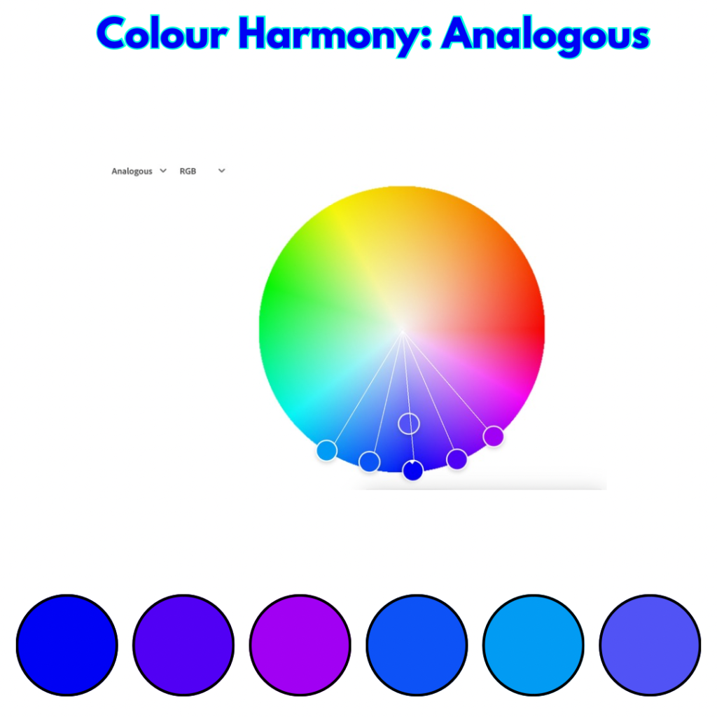
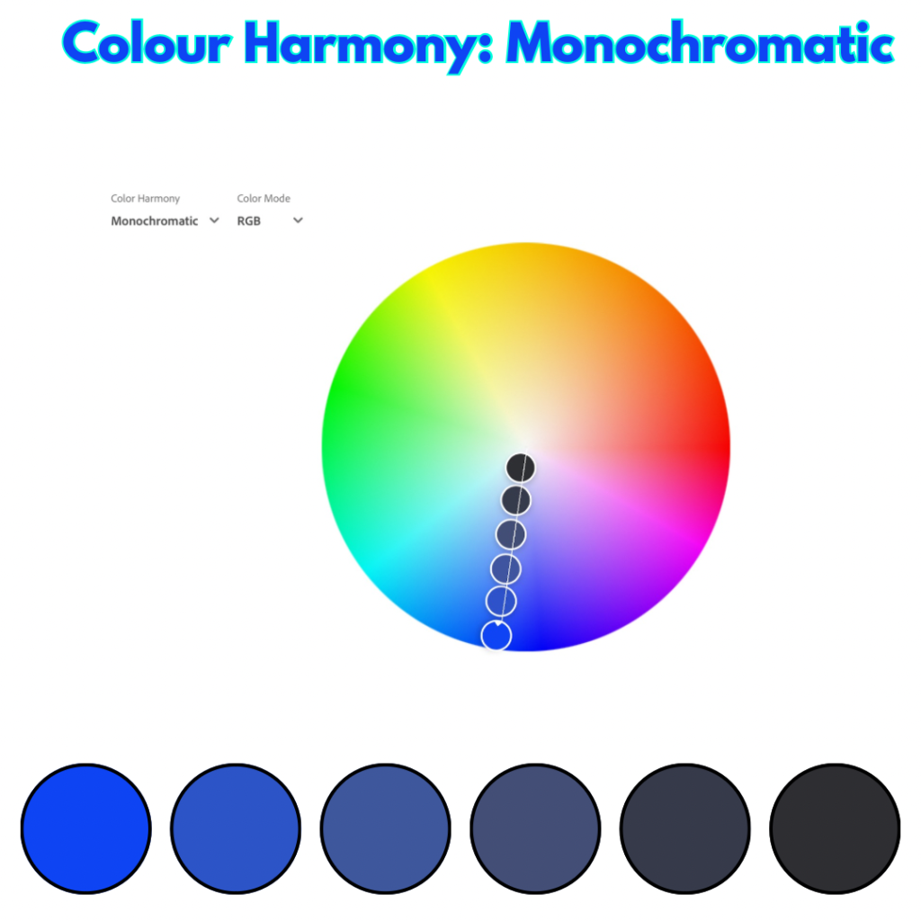
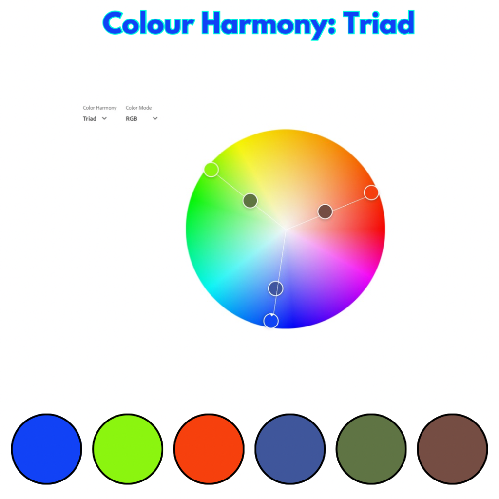
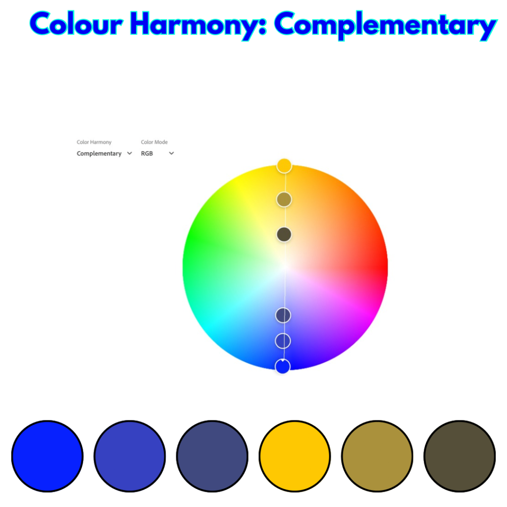
Colour Schemes
These are combinations of colour based on their relationship on the colour wheel for our starting colour of dark blue we have used Color Adobe and then itemised each colour below the wheel for easier reference.
- Analogous: Colours that are adjacent to each other on the colour wheel. They create harmonious and soothing colour schemes. eg. Dark Blue, Blue Purple, Mid Blue.
Monochromatic: Uses different shades, tints, and tones of a single colour. Creates a sophisticated and elegant look.
Triad: Uses three colours equally spaced on the colour wheel. Creates vibrant and eye-catching combinations.
Complementary: Uses two colours that are opposite each other on the colour wheel. Creates high contrast and energetic schemes.
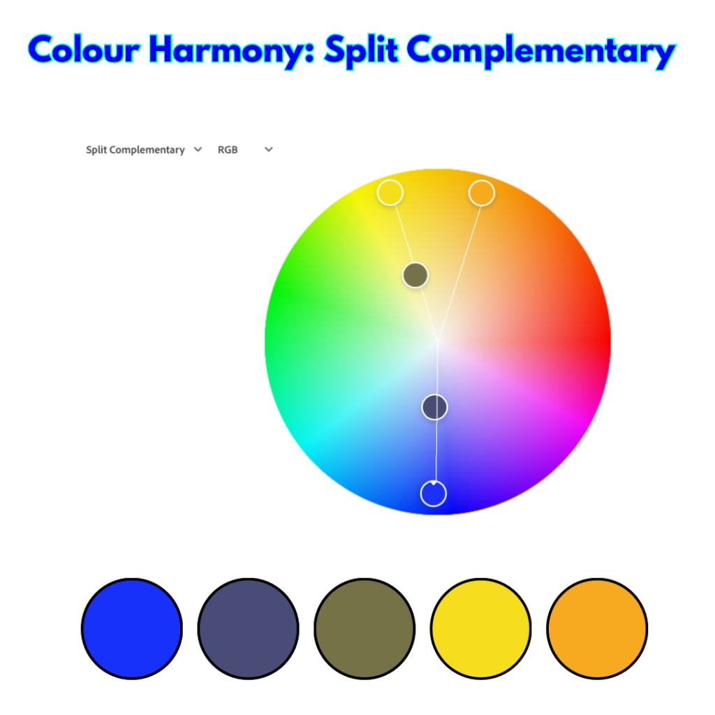
Split Complementary: Uses one colour and the two colours on either side of its complement. Offers a balance between harmony and contrast.
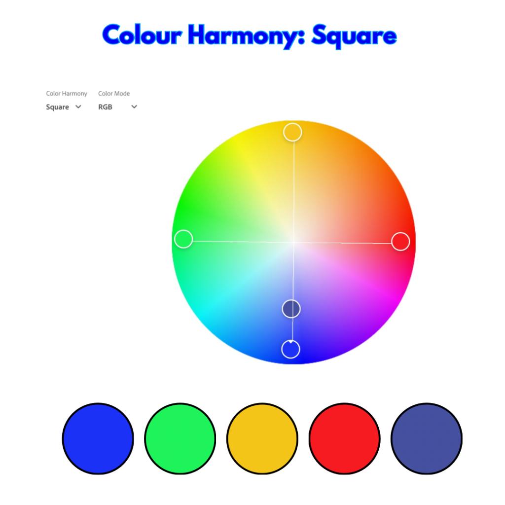
Square: Uses four colours equally spaced around the colour wheel. Creates bold and dynamic schemes.
Incorporating Dark Blue into Design and Branding.
Incorporating dark blue into your design or branding requires a careful approach to maximise its impact without overwhelming your audience.
Dos:
-Use as a Base Colour. Dark blue works well as a foundational colour, especially in corporate branding, where it can convey professionalism and reliability. Pair it with lighter tones or metallics to create a balanced and sophisticated palette.
-Accent with Bright Colours.To avoid a design that feels too heavy or sombre, consider using dark blue as an accent colour alongside brighter hues like yellow or orange. This contrast can add energy and dynamism to your design while maintaining a sense of stability. Pairing with white or gold can create a sense of balance and vibrancy.
-Consider Context-dark blue can be very effective in formal settings or industries where trust and authority are crucial. It’s a great choice for legal firms, financial institutions, and tech companies.
-Highlight Key Information. Text in a light colour against a dark blue background can be highly readable and create a sense of importance.
Don’ts:
–While dark blue is powerful, too much can make a design feel cold or unapproachable. Balance it with warmer or neutral tones to keep your branding inviting.
–Pairing dark blue with other dark colours, like black or dark grey, can create a gloomy or overly conservative look. Aim for contrast and clarity in your colour choices.
–Don’t Forget Audience Perception. As always consider your target audience when using dark blue. While it may project authority in one context, it could come across as too conservative in another. Tailor your use of colour to the values and preferences of your audience.
Conclusion
Dark blue is a colour that commands respect and instills trust, making it an invaluable asset in both psychology and marketing. Its depth and versatility allow it to be used in a wide range of applications. When used thoughtfully, dark blue can enhance brand identity, create emotional connections, and convey the values your audience seeks.
Some references
- Blue in Culture
- Understanding the Emotional Effects of Colour in Design. (2023). The Design School.
- Color Psychology The Power of Color in Everyday Life Angela Wright