
Contrast matters people! Today, I would like to share one of our biggest bugbears and one of the most common mistakes we encounter when auditing small business websites. That is the use of text against image backgrounds or coloured backgrounds that make it difficult for the reader to read. Mind you this also happens with social media posts too, and sometimes printed material.
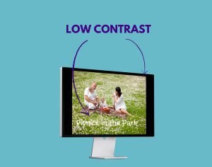
Many small business owners choose “pretty fonts”, pretty colours that make them feel good but they forget about their end user.
The readability of their text on a website for example plays a crucial role in engaging their audience and ensuring a positive user experience. The same applies for social media posts and print.
To avoid this pitfall, it is essential to carefully consider the choice of colours for both text and background elements.
SELECT CONTRASTING COLOURS
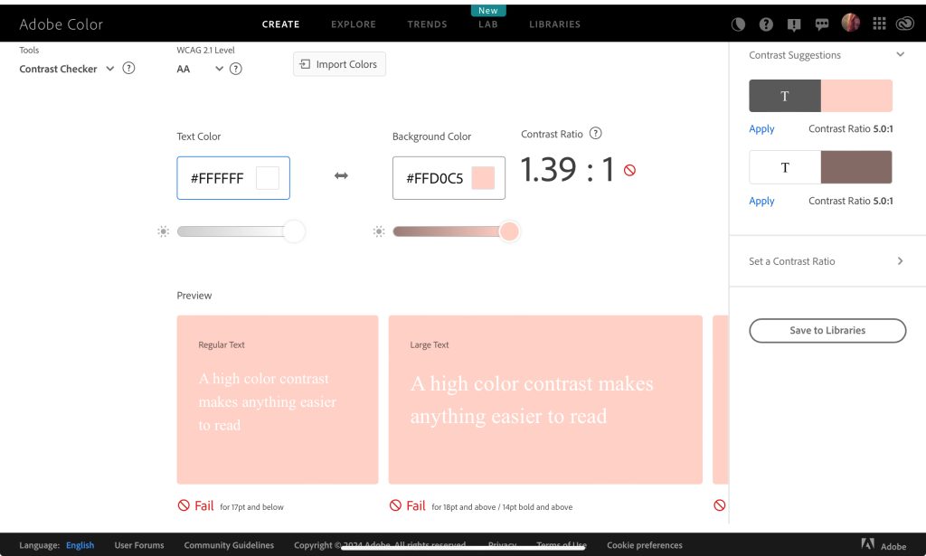
By using contrasting colours, you can significantly enhance the legibility of their content. For example, using dark-coloured text against a light-coloured background or vice versa can create a stark contrast that allows readers to effortlessly consume the information presented to them.
FONT SIZES, STYLES AND COLOUR.
Pay attention to font sizes and styles. Opting for fonts that are clear, concise, and easy to read will go a long way in facilitating comprehension. Make the font colour contrasting to the background. Additionally, adjusting font sizes appropriately ensures that individuals with visual impairments or those accessing the website from different devices can comfortably read the text without straining their eyes.
VISUAL ELEMENTS
Another consideration worth mentioning is the use of images or other visual elements alongside text. While these additions can undoubtedly enhance the overall aesthetic appeal of a website, they should not compromise readability. Careful attention must be paid to ensure that any visuals do not overshadow or clash with the written content, making it difficult for readers to focus on what matters most – the message being conveyed.
WEB ACCESSIBILITY.
Not only is there an issue of legibility, but also accessibility.
Accessible design principles align with good user experience practices overall, benefiting all users regardless of disability status.
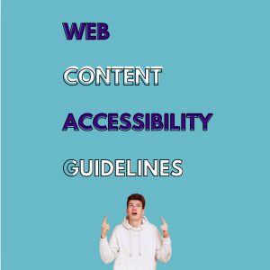
What are the Web Content Accessibility Guidelines (WCAG)?
The Web Content Accessibility Guidelines (WCAG) are a set of recommendations designed to make web content more accessible to people with disabilities. This includes guidelines for text readability, color contrast, and overall usability to ensure everyone, regardless of their abilities, can easily navigate and understand web content.
RESOURCES

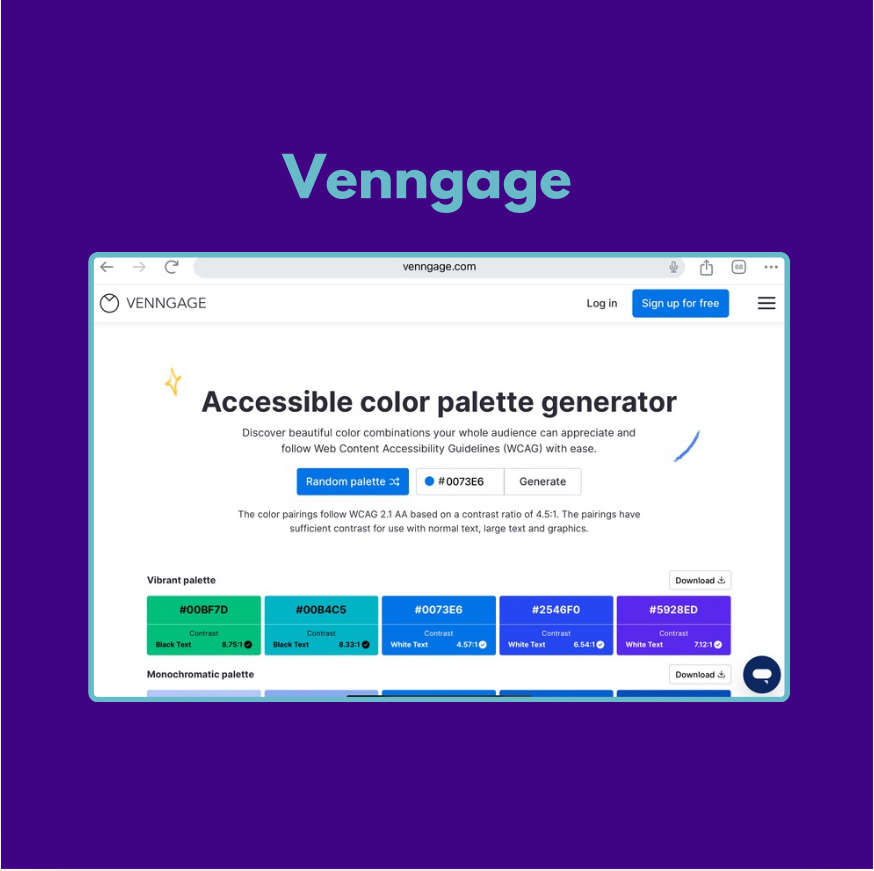
There’s a quick video on Venngage here
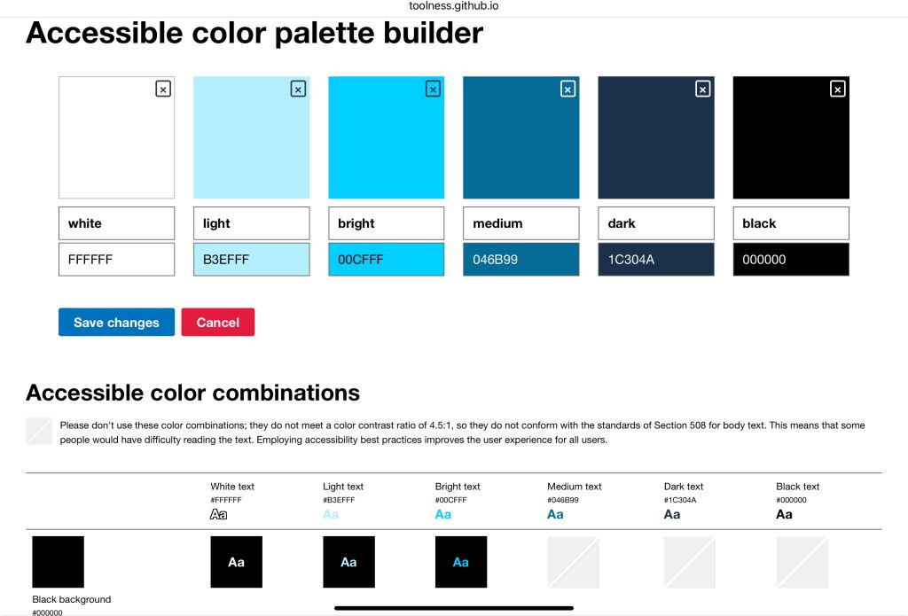
They all operate a little differently, if you are having trouble working them out- don’t stress—just reach out to us! We’re happy to help you out, no charge. We’re here to make sure your website looks great and works for everyone, so contact us here.
Let’s make it a priority to ensure that our websites social posts and marketing material are not only visually appealing but also easy on the eyes and effortless to read.