In the realm of DIY social media design, the right fonts can transform your posts from ordinary to attention-grabbing. Font pairing, though it may seem daunting, is a skill that can be learned. Let’s explore some beginner-friendly tips to help you choose fonts that enhance your brand’s social media presence.
There are numerous “font pairing” infographics on Pinterest. Remember while they look good with random words they might not suit your content or your brand. Use as inspiration rather than validation that the fonts will work for your particular case. Naturally if you have your own branding done you already you can use those fonts. Depending on the software that you use- you may not have the ability to upload those fonts, but you will know the style of fonts to choose that are consistent with your brand.
Another resource is Typewolf where you can find the top ten most popular fonts and they also have a definitive guide to free fonts
Understanding Font Categories.
Font choices can be grouped into four main categories – serif, sans-serif, script, and display. Here’s a quick breakdown for beginners. We’ve used Canva font examples as that’s the software most used our clients to create content.
1.Serif.
Classic and elegant, with decorative strokes. Perfect for conveying a traditional or established vibe.

2.Sans-serif.
Modern and clean, without the extra strokes. Ideal for a contemporary and streamlined look.

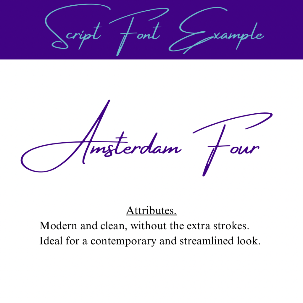
3.Script.
Mimics cursive handwriting, adding a touch of personality. Great for a more personal or creative feel.

4. Display.
Playful and attention-grabbing. Often used for headlines or special emphasis.

Create Contrast for Impact.
Begin combining fonts with noticeable differences. Pair a bold, eye-catching headline (perhaps in a display or script font) with a simple, easy-to-read body font (like a sans-serif). This contrast adds visual interest to your social media posts.
Prioritise Readability.
While experimenting with fonts, always prioritise readability. Ensure your chosen fonts can be easily understood on various devices and screen sizes. A clear and readable message is crucial for engaging your audience. See kerning.
Keep it Simple.
For beginners, simplicity is key. Limit your font choices to two or three to maintain a cohesive look. Too many fonts can be overwhelming.
Maintain Style Harmony.
Align your font choices with your brand’s style and theme. If your small business has a specific identity or theme, let your font choices complement that to create a consistent visual presence on social media.
Review.
We know people don’t usually review their designs but we encourage you to ask your partner, friend or heck I even used my kids in the early days to see if they could read it clearly. Also check for spelling errors.
As a small business owner venturing into DIY social media design, mastering font pairing is a valuable skill. By understanding font categories and embracing simplicity, you can create visually appealing posts that effectively communicate your brand’s message. Happy designing, and enjoy the creative journey! If you aren’t enjoying it or need help we are right here!

Pingback: Why Your Brand Needs More Than Just One Logo. - rawmarrowblog
Pingback: The 3-Minute Logo Redesign Challenge. - rawmarrowblog
Pingback: Font Licensing-What Every Small Business Owner Needs to Know. - rawmarrowblog
Comments are closed.