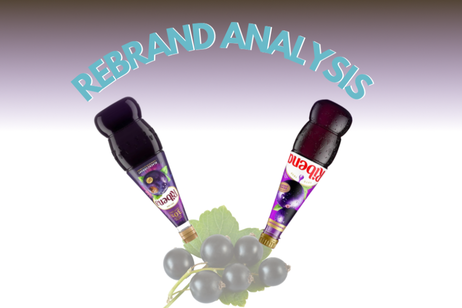
I came across a before-and-after image of Ribena’s rebrand on LinkedIn, and it got me thinking. (You can read about Ribena’s history here. ) As someone who remembers Ribena being positioned as a premium, fruit-heavy drink, I had a reaction to the change—and it wasn’t entirely positive. Reactions to design aren’t just about aesthetics. They’re about memory, trust, expectations and context. So let’s break this one down and look at what’s working, what’s not, and what it tells us about rebranding more broadly and assessing a rebrand. (Another rebrand analysis is here)
The majority of people loved the new rebrand. The rebrand was done by Elmwood and I couldn’t find the full brief for it, so it’s hard to know the full strategic intent.
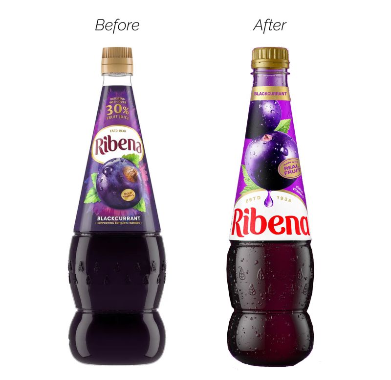
Bear in mind some people had associations with the brand and others didn’t. When I was growing up Ribena was considered premium with the most actual fruit compared to other cordials and syrups. So I was in the small group of people that didn’t think the rebrand was a complete success based on the before and after image presented. The old packaging reflected that deep purples, understated golds, and rich imagery that suggested quality and heritage.
The new branding, in contrast, feels like it’s lost that grounded, trustworthy feel.
First thoughts on the rebrand
Colour choice and hierarchy
The switch from a restrained purple and gold palette to a stark red logo on a white background breaks visual continuity and adds visual noise rather than clarity. The red feels garish and unanchored—it doesn’t communicate anything specific about the product (fruit? quality? freshness?) and instead becomes a dominant element without meaningful context. Maybe it’s saying “notice me” and is there simply to stand out so people can find it on the shelf?
Tone and authenticity
The new imagery to me is overly saturated with intense lighting and heavy highlights, which gives the fruit a synthetic, plasticy like feel. It’s trying to be “fresh” and modern but ends up looking artificial—more stock photo and overproduced than real produce. This undermines the product’s strongest asset the authenticity of its fruit content.
Typography
The typography for Ribena was developed Luke Ritchie who does great work you can check it out here. The Typography 100% modernises it and makes it “plumper”
It feels more generic and more disposable—closer to a soft drink than a heritage fruit-based product. Maybe part of modernising it?
Droplet icon
The bright purple droplet icon also seems over the top in colour (maybe to attract attention but again because of the colour screams artificial) it adds little and feels tokenistic and fake rather than integral.
Brand position shift
Visually, the rebrand moves Ribena from “trusted and premium” to “loud and contemporary.” That might work for new markets unfamiliar with the original—but it might alienate existing consumers who connected with its credibility and restraint.
Then I delved a little further into this rebrand and saw this before and after photo on Deezen along with an explanation of this rebrand.
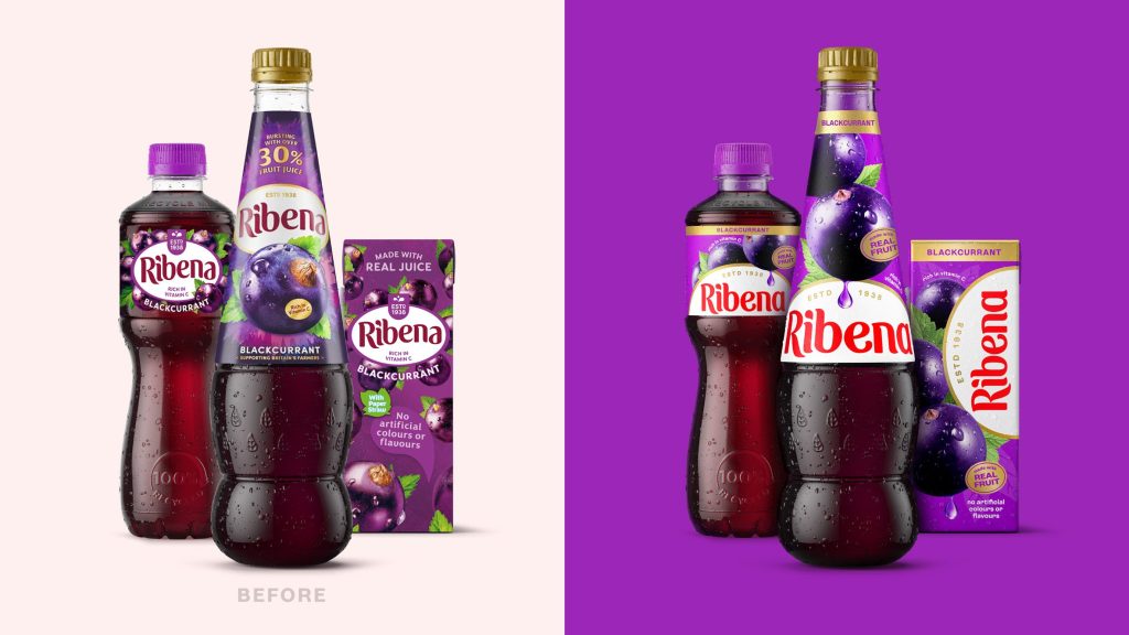
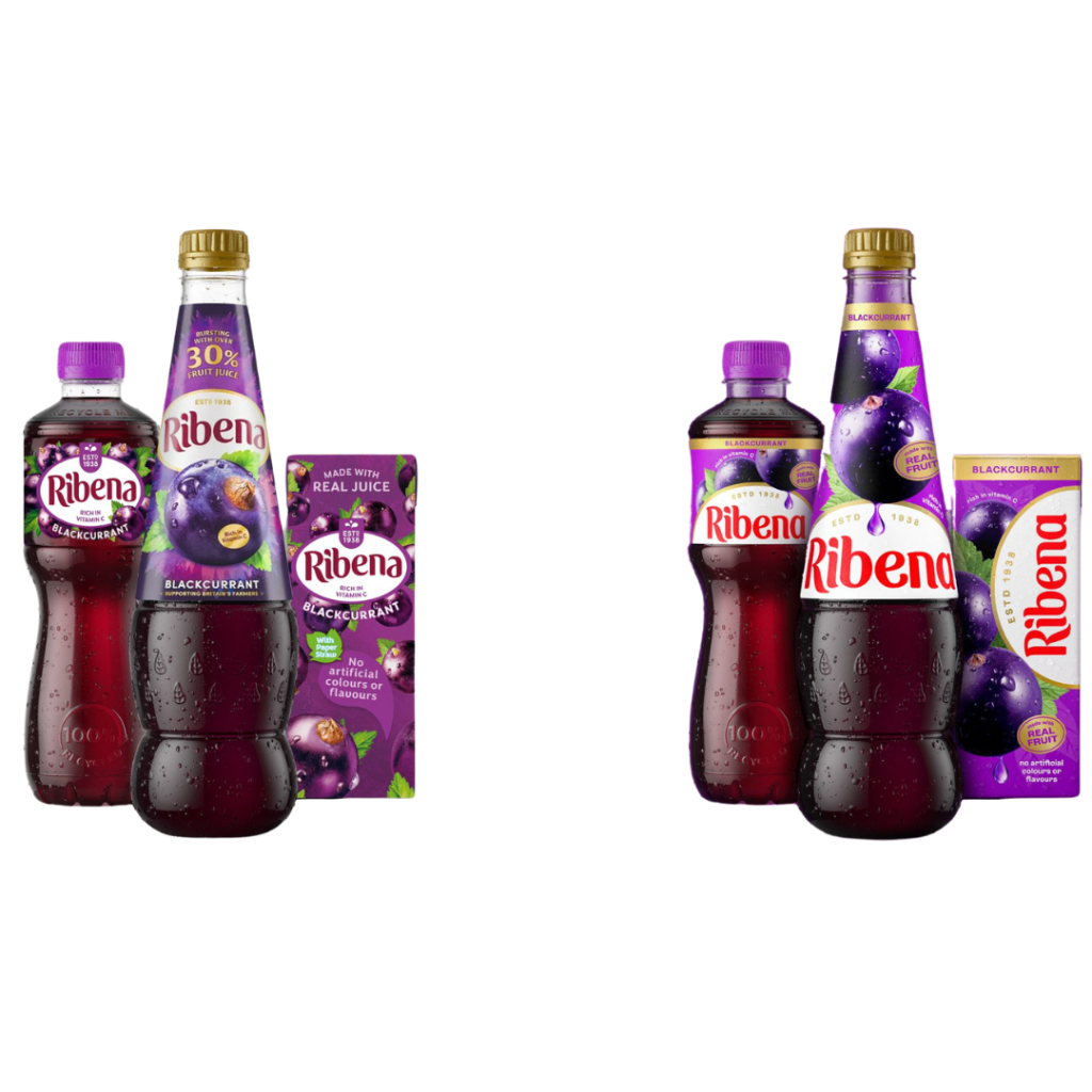
for comparison purposes I changed the photo to have no coloured background. So it’s a fairer comparison. (there’s a whole psychology of colours that come into play taster here)
Second Thoughts on Rebrand
The biggest improvements when I look at this after photo is
Curved white space on the juice box.
I love this,the flowing, curved white space on the juice box is one of the strongest visual moves. It creates a sense of motion and freshness, breaks up the heavy purple, and gives the red wordmark room to breathe and it stands out (still questioning whether this shade of red is the right move though) It’s a modern layout device that adds energy without feeling cluttered. It’s also consistent across the 3 products just different orientation. I feel that this would help it stand out on the shelf.
Simplified fruit imagery.
The new blackcurrant illustrations are larger, cleaner, and less busy. While I noticed this on the first before and after picture it was more noticeable on this picture. There’s more focus on the product and less visual clutter. This simplifies the message and makes it easier to scan quickly, especially in a supermarket context. I still feel however the product itself looks overdone/oversaturated and unnatural compared to the before ones which could have been made larger cleaner and less busy instead.
This shows how much context influences our judgement, especially in design.
The wide range of opinions (even the different views of me depending which before and after picture I am looking at!) about this rebrand highlights a simple truth in design. How something is received always depends on individual context, personal associations, and what someone values in a brand. A design that feels fresh and modern to one person might feel loud and impersonal to another.
As designer Jarrett Fuller once said, “Design is both a noun and a verb, a process and a product, an action and a result.”
What’s considered “good” design isn’t fixed—it shifts depending on who it’s for, where it shows up, and what it’s meant to communicate. There’s no one-size-fits-all approach, this is why testing and research in rebranding is important especially with well established brands.
Interestingly, my opinion shifted when I saw the second set of before-and-after images on Dezeen. Without the coloured background, some of the design decisions became easier to appreciate. The curved white space on the juice box, for example, stood out as a thoughtful touch—it added movement, breathing room, and helped the red wordmark feel more intentional. I also started to see the typography differently after reading more about it on Luke Ritchie’s site. Once I understood the reasoning behind the letterforms, the logo felt less random and more like a deliberate creative move.
The thing is most people don’t go into this level of detail. They’re not comparing packaging versions side-by-side or digging through a typographer’s portfolio to understand the logic behind a single letter. They’ll glance at the bottle for a few seconds and make a snap judgement. Does it look familiar, premium, interesting, or trustworthy? That first impression carries weight. Which is why in branding, especially for businesses with an existing customer base, perception often supersedes intention.
That said, doing this kind of rebrand comparison is valuable for me as a designer. It sharpens my eye, helps me stay critical, and is a reminder that the goal isn’t to make something just “look good”. (wrote about that here) It’s to make it work for real people in real contexts. I’m constantly testing how different visual decisions affect meaning, emotion and usability.
When I work with you as a client, I’ll always be able to justify every design decision. Nothing is chosen at random. It’s based on the brief, the goals of your brand, the psychology of how people process visuals, and solid design principles like hierarchy, contrast, clarity, and cohesion. I ask you a lot of questions. My job isn’t to decorate—it’s to communicate. To make sure what your audience sees, matches what you’re really about.
Thinking of a rebrand or need some branding here we are!