Logos.

While your logo is only one component of your brand identity. Your logo is the first visual representation of your brand.
“A well-designed logo will be memorable, helping customers to remember the brand. Shapes and colours are easier for the human brain to process and memorise than words are. This means that if the identity is unique in the marketplace it’s easy to find and identify the company once again to purchase its services, and to recommend to friends.”- LogoGeek
I believe if you have gone to the trouble of creating a business it is worth taking the time to get the branding and your logo right. Recently I noticed on my social media channels a few new businesses popping up (most likely related to Covid 19), and I noticed that a lot of the businesses had very similar logos. As I’m a sticky beak I went into Canva– and sure enough my suspicions were confirmed. Now this is a quick, cheap and easy way to “get a logo”, and most people won’t know your logo came from Canva. (I have nothing against Canva, it’s a great tool for businesses, if you are new or want some tips grab our free Canva download). However, online logo makers (there’s many out there) have a few problems. Maybe if you’ve just decided to open a business spur of the moment and intend running it on Instagram it may be ok. However, the quickest and cheapest way may not work for all brands. Some businesses used to run without a logo just fine, but times have changed and visual identity and recognition is more important in 2020 than ever.
The problem with “logo makers” is that with more people using them, there are too many brands that have logos that look similar, this can be confusing for clients. Sure, you may have used a different colour but the logo shape is the same. Ideally you don’t want to look the same as any other business. Also if you have just grabbed a logo off somewhere, it implies you don’t care enough about your business to give it the love it deserves, which can lead your your audience not respecting your business either. It shouldn’t be something that is rushed and picked randomly without any thought. Why pick something that is available to the masses to represent your brand? We always advise if you don’t have the money use a simple wordmark with a commercially free font or that you
There are limited customisations of fonts/colours/design, there are no original graphics and in addition some of the online logo makers are limited in their format type which limits your use of them.
Here at rawmarrow we use Adobe Illustrator which is a vector based software program- this means we can scale your logo any size from a billboard, to a business card to a digital favicon.
Although it may seem a cheap way to “get a logo”, a logo maker may cost both in time and money in the long run. Although there are some reasons to rebrand (we will deal with this in a separate blog post) you DO NOT want to be constantly changing your logo/branding (and I’ve seen people rebrand more than three times in a single year, this just says your business is confused about what it is and what it is doing-each time you rebrand that’s costing you money in the design and your printed collateral) and it’s also confusing for your followers and clients. If you are passionate about your business, you should be passionate about your logo also.
Speaking of passion, recently Arnott’s announced their corporate logo and in the graphic design forums there has been much discussion about it.
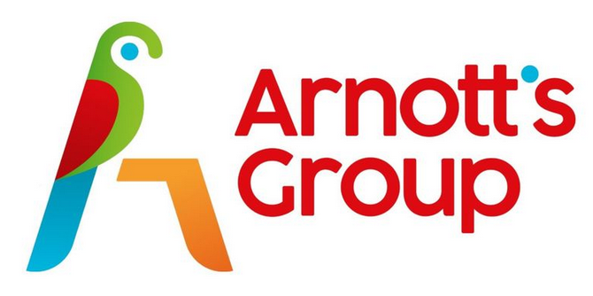
Later the general public weighed in on this thinking it was going to replace the original logo on the biscuit packets (it’s not- the original parrot will remain on your Tim Tam packet, so relax. You can read about how the original logo was developed here). The outcry reminded me a bit of when the famous store GAP changed it logo in 2010 and then reverted back to the original a week later – because the public were so passionate about it on social media.
Your logo has to reflect your brands personality.
It’s no good if you are a lawyer with a clown graphic as a logo for example. Unless you are a lawyer specialising in circus law, than maybe we can make something work, but you get the idea. 🙂
Real life example, many years ago I was asked to create a new logo and business card for the Sassy Celebrant, who has kindly allowed me to share this. Now the Anna had the “sassy celebrant” line in website and material and yet this was the front of her business card without the black marks obviously I did that for privacy reasons. Bear in mind that this was a while ago and everyone has to start somewhere.
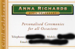
Where was the Sass in this card? At the time she was the only celebrant using the sassy celebrant yet it wasn’t consistently on her branding. After an extensive questionnaire and some refining this was the resulting logo and front of her new card.
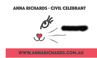
While Anna has retired from being a celebrant she still uses the logo for fun in her social media. This is a nice endorsement of a logo, as she still identifies with it.
Considerations of a logo design.
- A logo needs to be memorable.(eg. the Nike swoosh)
- Simple- quickly recognisable,(eg. McDonalds) and helps to keep it memorable.
- Creative,intriguing or clever
- Not all logos need a symbol
- The logo does not have to literally show what a company does. For example the Apple logo isn’t a computer).
- Versatile (scalable, and can be used in a range of settings, digital and print, horizontal and landscape, animated).
- Timeless not trendy.
Process for Logo Design.
At rawmarrow we have a specific process we follow when designing a logo.
- Research about your company/brand or you (if individual logo)- this includes you answering an extensive questionnaire
- I also research your industry and competitors.
- Brainstorming (Taking the information from steps 1 and 2 into consideration) – start to conceptualise ideas and design direction
- Sketching (yes old fashioned sketching) of logo concepts and ideas.
- Digital Design.
- Presentation of at least 3 designs in black and white (we always design in black and white, so that the focus is on the logo form rather than getting distracted colour as explained here). We get your feedback and make refinements as required.
- Presentation of Designs in colour along with branding board if applicable.
- Once you have chosen your final design I will prepare your logo package containing files for both web (website and socials) and print use along with your branding guidelines booklet (soon to be available online in a client portal for easy access to logos and information).
If you need help we would love to work with you, however if you think all you need to brand your business is a logo you won’t be a good fit for us and you may prefer to go to fivver pay your money and be on your way. If you have created a logo yourself or used a logo maker and want some feedback we have a service specifically for that here.
If you want us to work with you as your business partner across all aspects of your brand identity get in touch!
Pingback: Creating Memorable Logos That Resonate and Stick - rawmarrowblog
Pingback: AI-Generated Logos: Navigating the Complex Landscape Of Copyright Issues - rawmarrowblog
Pingback: Reflect on AI Generated Logos for your Business. - rawmarrowblog
Pingback: Why You Shouldn’t Use Canva Templates for Your Logo. - rawmarrowblog
Pingback: The 3-Minute Logo Redesign Challenge. - rawmarrowblog
Pingback: Why We Don’t Offer “Brand in a Day” (And What to Consider Before You Book One) - rawmarrowblog
Pingback: Personal Branding: What’s the fuss? - rawmarrowblog
Comments are closed.