
What the heck is kerning?
Kerning is the typographic term for the process of adjusting the spacing between individual characters or letters in a font.

1. Kerning is the spacing between letters and characters.
2. Kerning can make a big difference to readability of any text based design.
3. Bad Kerning can make a bad difference to your brands perception.
It’s a subtle but important aspect of typography that can have a big impact on the readability, legibility, and overall aesthetics of your text.
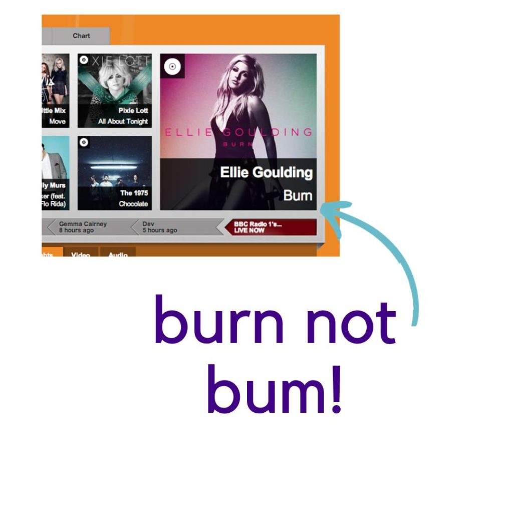
When letters are kerned correctly, they create a visually even and harmonious rhythm. This makes the text easier to read and more pleasing to the eye. Poor kerning, on the other hand, can make text look cluttered, unprofessional, and even difficult to read.
Kerning is a vital aspect of typography that often goes unnoticed but plays a significant role in enhancing the visual appeal of written content. Clients are usually unaware of kerning issues in their branding or brochures until we draw it to their attention. At Rawmarrow we are acutely aware of how small details like kerning can make a big difference in branding and content creation.

The Art of Kerning: Enhancing Your Visual Message
Typography is more than just selecting a font; it’s about how letters and characters interact with each other. Kerning is the process of adjusting the spacing between individual letters or characters to ensure a harmonious and visually pleasing result.
1. Aesthetic Appeal
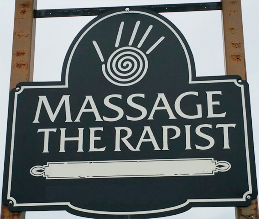
Kerning directly affects the aesthetics of your text. Proper kerning creates an even, balanced flow of characters, making your content look more polished and professional. It prevents awkward gaps between certain character combinations, such as “VA” or “To.”
2. Readability
Good kerning improves readability. When letters are properly spaced, readers can more easily distinguish individual letters and words. Well-kerned text is easier to read because it creates a more even rhythm and flow. This allows the reader’s eye to move smoothly from one letter to the next, without having to stop and start to make sense of the words.
3. Brand Identity
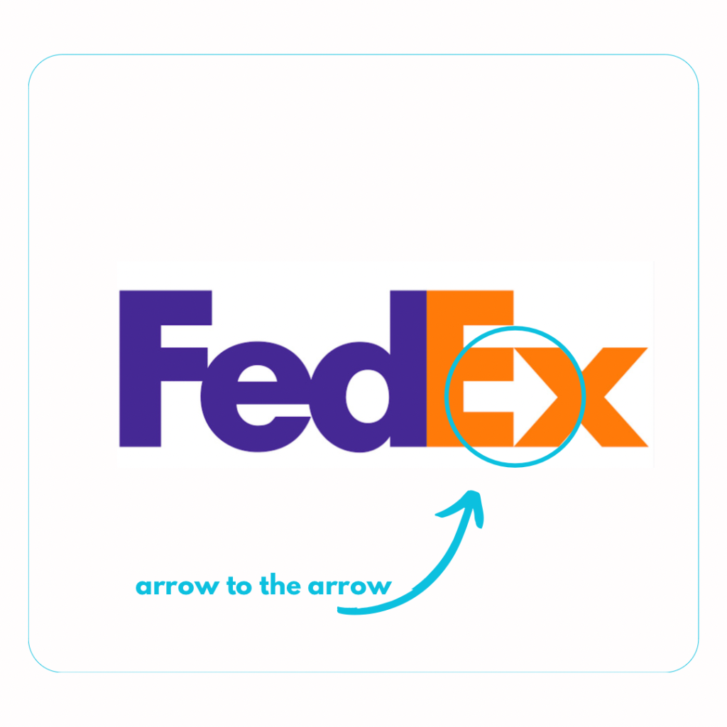
In the world of branding, kerning is a powerful tool. Custom kerning can give your brand’s name a distinctive look. Consider iconic logos like FedEx, where the hidden arrow between ‘E’ and ‘x’ is a result of meticulous kerning. It makes your brand memorable.
4. Emotional Impact
Kerning can also convey emotions. Tight kerning can create a sense of urgency or intimacy, while looser kerning can make content feel more relaxed. Your choice of kerning should align with your brand’s message and tone.
5. Legibility
Kerning is essential for various media, from print to digital. Kerning is especially important when using smaller fonts or fonts with complex letterforms. By adjusting the spacing between letters, kerning can help to prevent letters from blending together or becoming too difficult to distinguish. It ensures legibility across different platforms and screen sizes, which is especially important in today’s world of responsive design.
6. Consistency
Consistency in kerning helps maintain a unified brand identity. All your marketing materials, from business cards to website headers, should have a consistent kerning style.
Kerning-Font letter awareness.
There are certain font families and combinations of letters that don’t work.
It’s impossible to list them all here but some common examples to look for are.
-
“LI” with certain fonts as they can form a “U
-
“LV” and “VL” can also be confused for “U” in some fonts.
-
“To” and “VA”: In some fonts, when the letters “T” and “o” or “V” and “A” are placed close together without proper kerning, they can create awkward gaps or even appear as a single letter.
-
“AV” and “WA”: Without proper kerning, the “A” and “V” or “A” and “W” can seem to merge into one another, affecting readability. This is especially true of, sans-serif fonts with wide apertures.
-
“WA” and “AW” can look too far apart in some fonts, such as serif fonts with narrow apertures.
-
“IY” and “YI” can be confused for “H” in some fonts.
-
“FI” and “IF” can be confused for “E” in some fonts.
-
“FF” and “LL” can look too close together in some fonts.
-
“Ff” and “Ll” can look too far apart in some fonts.
-
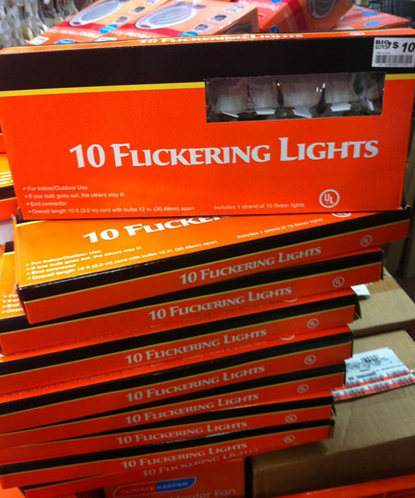
“rn” and “nr” can be confused for “m” in some fonts.
-
“rs” and “sr” can be confused for “o” in some fonts.
-
“TY” and “WA”: When the letters “T” and “Y” or “W” and “A” are not kerned properly, they can create uneven spacing that affects the flow of the text.
-
Te” and “le”: In some fonts, the combination of “T” and “e” or “l” and “e” may need kerning adjustments to prevent them from appearing too close or too far apart, which can disrupt the text’s appearance.
-
“CT” and “VA”: Certain fonts might require specific kerning adjustments for “C” and “T” or “V” and “A” to avoid unintended joins or awkward spacing.
-
“PO” and “RT”: In typography, the spacing between “P” and “O” or “R” and “T” is crucial. Poor kerning can make these combinations appear disjointed or excessively connected.

OK so that was probably way too much information, basically if you are working on branding or content yourself just be aware of the font and letter combinations, step back and make sure they work together, show other people and ask if it is easy to read or if there are any issues they are seeing that you can’t.
Tips for DIY Kerning.
- Pay attention to the negative space- The negative space between letters is just as important as the letters themselves. When kerning, look for areas where the negative space is too large or too small.
- Consider the shapes of the letters: Some letters, such as “A” and “V,” have naturally wide apertures (the openings in the letters). Other letters, such as “I” and “l,” have very narrow apertures. When kerning, adjust the spacing between letters to create a more even rhythm.
- Look for optical illusions: Some letter combinations can create optical illusions, such as the “WA” combination. When kerning these letters, you may need to adjust the spacing slightly to prevent the letters from looking too close or too far apart.
- The best way to determine whether or not a particular font family and letter combination works well together is to experiment and see how it looks.
Kerning is a subtle but important aspect of typography that can have a big impact on the readability, legibility, and overall aesthetics of your text. By taking the time to kern your text carefully, you can create a more polished, professional, and visually appealing look for your designs.
At Rawmarrow, we understand that kerning is more than just a technical aspect of design. It’s an art that can influence how people perceive your brand and its content. By paying attention to this small but crucial detail, you can set yourself apart in the competitive world of design and content creation.
So next time you’re working on branding, content creation, or any design project, remember that kerning matters. It’s the fine brushstroke that can turn a good design into a great one, and shameless plug 😉 you can outsource to us if you don’t want to stress about these details. We eat all aspects of design for breakfast and love to helping small businesses thrive in both digital and print.
In the end, it’s the small details that make a big difference, and kerning is one of those details that can elevate your design and content to new heights.
We will discuss some other aspects in future blog posts.
Pingback: The 3-Minute Logo Redesign Challenge. - rawmarrowblog
Comments are closed.